Extraction Curve Analysis - a podcast by Scott Rao
from 2019-04-07T20:03:21
Most of my work over the past ten years has involved analyzing roast-curve data for clients. Those years spent analyzing tens of thousands of curves have helped me identify consistent, verifiable relationships between curve shape and cup quality. Regardless of a clients’ roasting goals, that experience has usually made it easy to help the client immediately improve upon a roast simply by looking at a curve and suggesting alternative settings.
As I gain experience on the DE1, I’m learning to read its tablet’s curves and benefit from them. Below is a discussion of the most typical curve shape (ie a bad one). I think of this shot as the espresso equivalent of a roast curve with an ROR crash and flick. Mind you, the art and science of analyzing extraction curves is much more immature and speculative than that of analyzing roast curves; we’re still deciphering what all of this means.
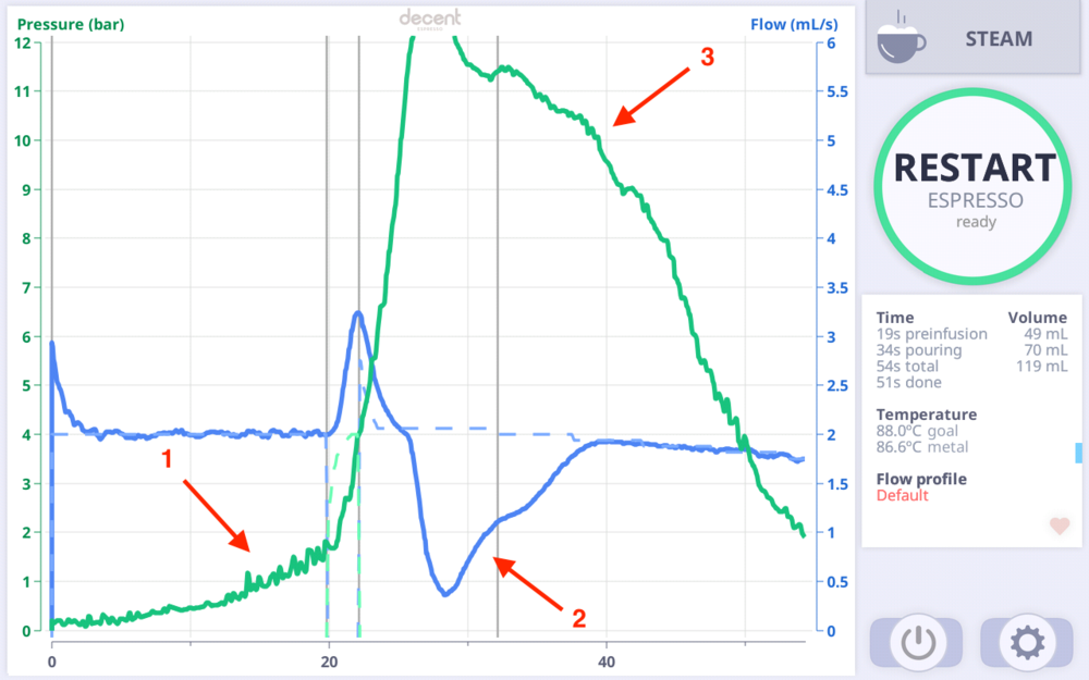
This shot was generated using a flow profile. The green line represents pressure and the blue line indicates flow. The red numbers indicate important feedback.
The volatility in the pressure curve indicates channeling during preinfusion. Despite being in flow mode— which helps “fix” channels as they form— a fair amount of channeling still occurred. I have little doubt this shot suffered from poor puck prep or too many clumps in the dry grounds.
The collapse in flow after preinfusion likely indicates the grind is too fine (note the peak pressure of twelve bar), causing too much puck compression to allow the desired flow rate to occur. The high pressure could also be due to too large of a dose, but I’m assuming we use a consistent, appropriate dose.
The phase from 25s to 40s where the pressure declined gradually is what John calls the “healthy extraction phase.” On some shots, the gradually declining pressure does, in fact, seem healthy— we believe it indicates no significant channeling while the puck erodes. On this shot, it’s debatable how much of this phase reflects “healthy extraction” and how much it indicates the puck is too compressed and/or still absorbing liquid (ie incomplete preinfusion). The steep pressure drop after #3 almost certainly indicates the formation of channels as the puck erodes.
We are confident that we prefer shots with smoother pressure curves, steadier flow after preinfusion, more gradual pressure decline after the pressure peak, and smoother pressure curves. Those observations have proven valid in both directions— when we see those curve features, the shots generally taste better. And when we taste numerous shots of a given coffee, the best-tasting shots turn out to have had such curves.
It’s still early days in my Decent Education, but the DE1’s graphs have already made me a better barista, and it’s a lot more fun and interesting to pull shots with the feedback of the DE1’s graphs.
For reference, the graph below is what I would consider “excellent',” and it coincidentally (?) looks quite a bit like a steadily declining ROR curve. Cropster for espresso, indeed.

Further episodes of Q
Further podcasts by Scott Rao
Website of Scott Rao